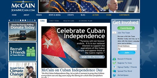
The blue is less harsh on the eyes than his previous black background. I also
like the yellow accent color throughout the pages. I'm disappointed that his
Blip.tv videos are still hidden so you can't embed them. Blip.tv videos appear
in higher quality resolution than YouTube.
There's also a green theme in his Web site. Perhaps, signaling that he is supports
green environmental issues, thus, he's not George W. Bush, darn it!
All in all I think it looks much better than before. It's still not as visually appealing
as BarackObama.com but it's an improvement. Tell me what you think?
Also, my friend Faith Camp who works for WITF out of Pennsylvania recently
attended an McCain event and did a write up. So, check it out.
No comments:
Post a Comment